A mockup
I’ve not done a lot of app design that isn’t a mobile game before, so sitting down and designing an actual app was fun and challenging.
We’ve all ordered food from a food delivery app before, so I took my own experiences with a bad app and tried to think what I would want a good delivery app to look like.
Sketches

Before I started creating blockouts in Figma, I first started sketching out what I wanted it to look like. I created a pretend case where I had a customer who’s delivery app was doing poorly, and started to imagine what those problems could be.
Things like not having a proper landing page which shows things near you and what other’s are ordering, or even having a separate section at the top where you can reorder what you had last time.
Once I had gotten a better understanding for how I wanted it to look, I started to look for a color palette. What I was mainly looking for were colors that wouldn’t create discomfort to the user and instead make it easy to find what you’re in the mood for.
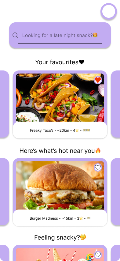
Landing Page
This meant having two main colors that would help create a contrast between the background and the foreground, the latter having restaurants and places to order from highlighted with a soothing purple. I did of course jump back and forth from what colors I wanted, but ultimately ended up with what you see above.
Shopping Cart

I’m not 100% happy with the designs, as some of them don’t have all the oomph I was looking for. Like the shopping cart for example, here I still retain the colors but the list of items are way too simple- which feels lackluster. On the other hand the fact that the cart is so simple and easy too read could be beneficial for users who struggle to understand what they’ve even added to their cart and what their paying for.
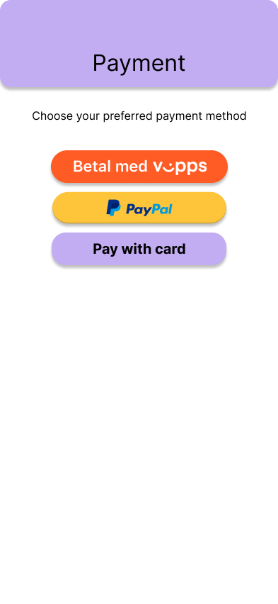
Payment Screen
Payment screen, just as the shopping cart, is simple and easy to understand- not a lot going on either in the design or in the process here. I tried to think what would be the fastest and easiest layout for people to pay and get their food.
Delivery Screen
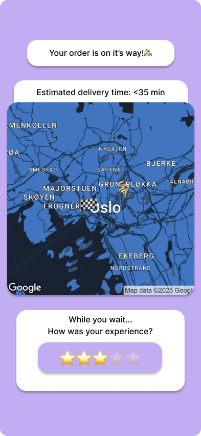
Here we have the color palette reversed along with a map to see where the courier is right now. While customers wait for their food I added a CTA (call to action), asking users how they found their experience with the app.
All in all, I’m happy with the designs here. They might be a little on the simple side but that makes it easier to understand what’s going on. If I had to do it again, I might’ve gone deeper into how each window would look like and interact with each other, probably creating a map of how they are laid out.

Leave a comment